Back chapter figures
Figure Atlas.24
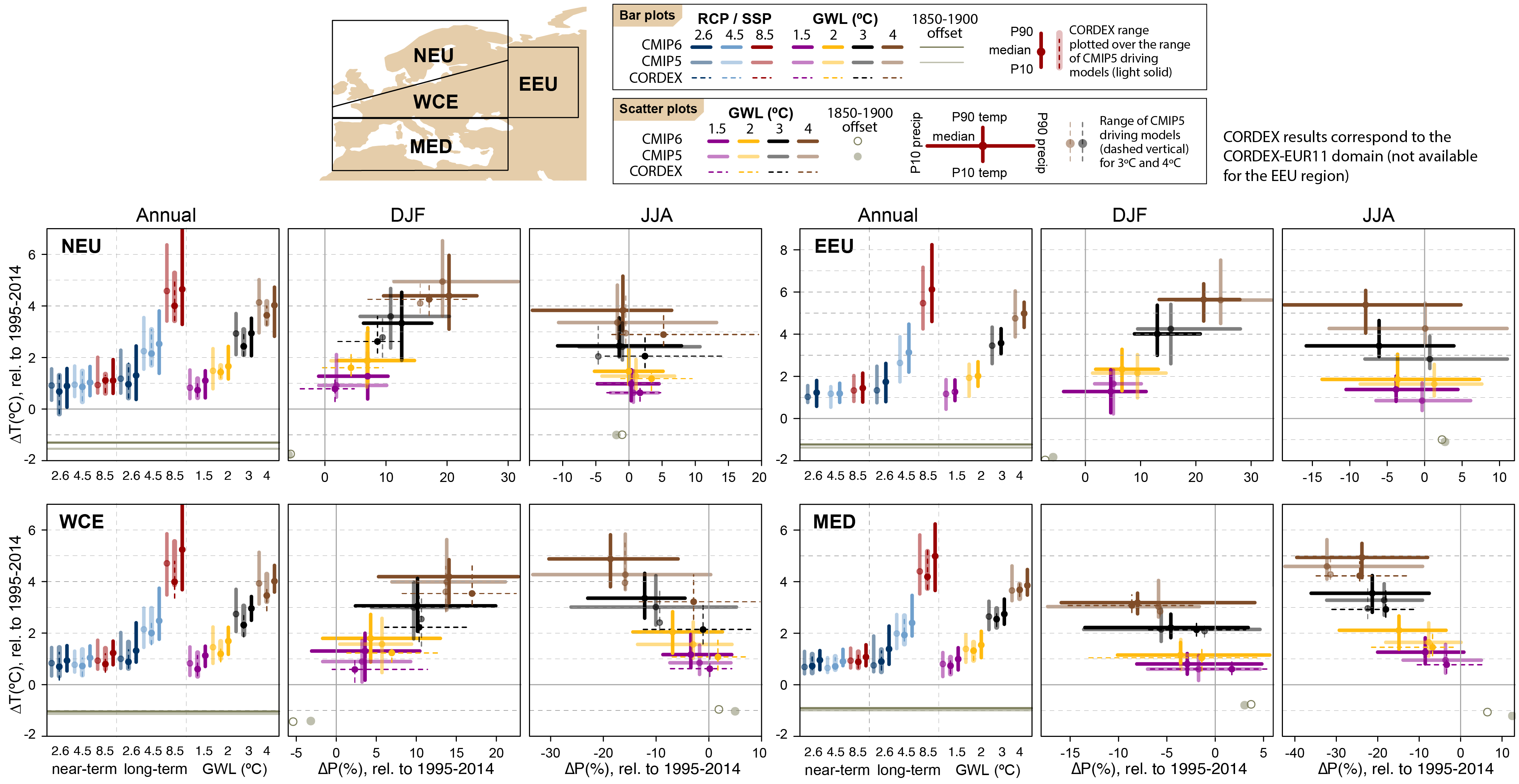
Figure caption
Figure Atlas.24 | Regional changes over land in annual mean surface air temperature and precipitation relative to the 1995–2014 baseline for the reference regions in Europe (warming since the 1850–1900 pre-industrial baseline is also provided as an offset). Bar plots in the left panel of each region triplet show the median (dots) and 10th–90th percentile range (bars) across each model ensemble for annual mean temperature changes for four datasets (CMIP5 in intermediate colours; a subset of CMIP5 used to drive CORDEX in light colours; CORDEX overlying the CMIP5 subset with dashed bars; and CMIP6 in solid colours); the first six groups of bars represent the regional warming over two time periods (near-term 2021–2040 and long-term 2081–2100) for three scenarios (SSP1-2.6/RCP2.6, SSP2-4.5/RCP4.5 and SSP5-8.5/RCP8.5), and the remaining bars correspond to four global warming levels (GWLs: 1.5°C, 2°C, 3°C and 4°C). The scatter diagrams of temperature against precipitation changes display the median (dots) and 10th–90th percentile ranges for the above four warming levels for December–January–February (DJF; middle panel) and June–July–August (JJA; right panel), respectively; for the CMIP5 subset only the percentile range of temperature is shown, and only for 3°C and 4°C GWLs. Changes are absolute for temperature (in °C) and relative (as %) for precipitation. See Atlas.1.3 for more details on reference regions (Iturbide et al., 2020) and Atlas.1.4 for details on model data selection and processing. The script used to generate this figure is available online (Iturbide et al., 2021) and similar results can be generated in the Interactive Atlas for flexibly defined seasonal periods. Further details on data sources and processing are available in the chapter data table (Table Atlas.SM.15).