Back chapter figures
Figure 1.25
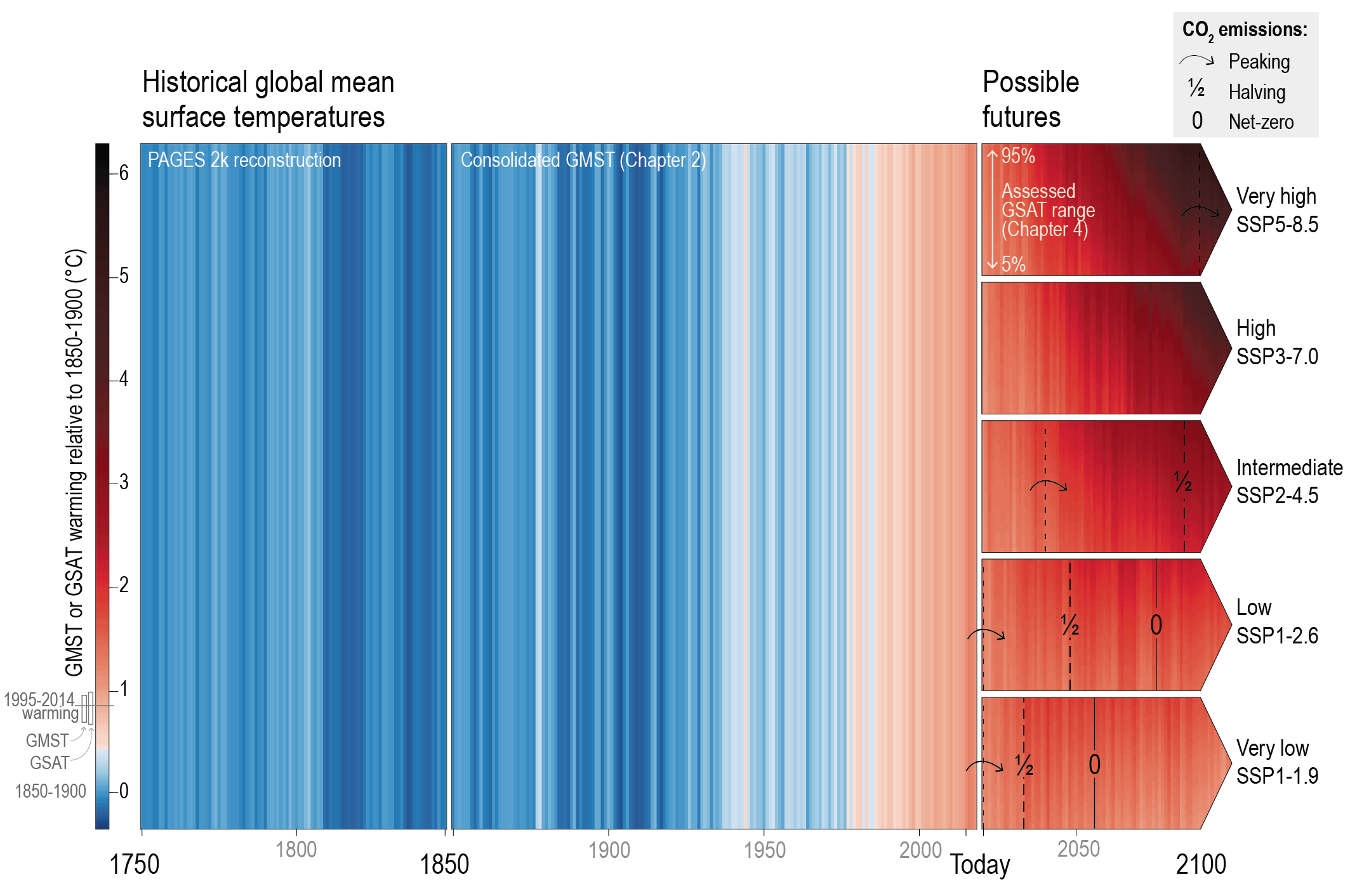
Figure caption
Figure 1.25 | Global mean surface air temperature (GSAT) illustrated as warming stripes from blue (cold) to red (warm) over three different time periods. From 1750–1850 based on PAGES 2K reconstructions (PAGES 2k Consortium, 2017, 2019); from 1850–2018 showing the composite GSAT time series assessed in Chapter 2; and from 2020 onwards using the assessed GSAT projections for each Shared Socio-economic Pathway (SSP) (from Chapter 4). For the projections, the upper end of each arrow aligns with the colour corresponding to the 95th percentile of the projected temperatures and the lower end aligns with the colour corresponding to the 5th percentile of the projected temperature range. Projected temperatures are shown for five scenarios from ‘very low’ SSP1-1.9 to ‘very high’ SSP5-8.5 (see Cross-Chapter Box 1.4 for more details on the scenarios). For illustrative purposes, natural variability has been added from a single CMIP6 Earth system model (MRI ESM2). The points in time when total CO2 emissions peak; reach halved levels of the peak; and reach net zero emissions are indicated with arrows, ‘½’ and ‘0’ marks, respectively. Further details on data sources and processing are available in the chapter data table (Table 1.SM.1).