Box 10.3 Figure 1
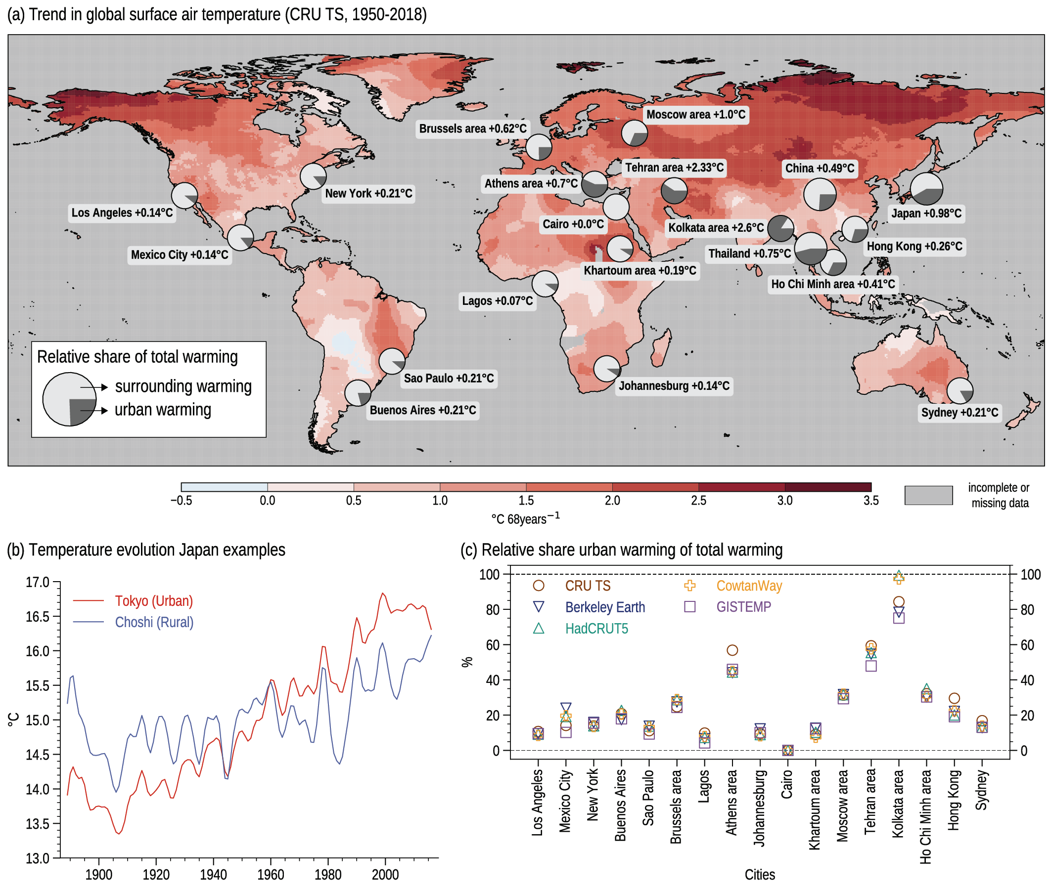
Figure caption
Box 10.3, Figure 1 | Urban warming compared to global GHG-induced warming. (a) Change in the annual mean surface air temperature over the period 1950–2018 based on the local linear trend retrieved from CRU TS (°C per 68 years). This background warming is compared to the local warming that has been reported during 1950–2018 in the literature from historical urbanization. The relative share of the total warming as percentage between the urban warming and the surrounding warming is plotted in a circle for each city. This map has been compiled from a review study (Hamdi et al., 2020). (b) Low-pass filtered time series of the annual mean temperature (°C) observed in the urban station of Tokyo (red line) and the rural reference station in Choshi (blue line) in Japan. The filter is the same as the one used in Figure 10.10. (c) Uncertainties in the relative share of urban warming with respect to the total warming (%) related to the use of different global observational datasets: CRU TS (brown circles), Berkeley Earth (dark blue downward triangle), HadCRUT5 (cyan upward triangle), Cowtan Way (orange plus) and GISTEMP (purple squares). Further details on data sources and processing are available in the chapter data table (Table 10.SM.11).