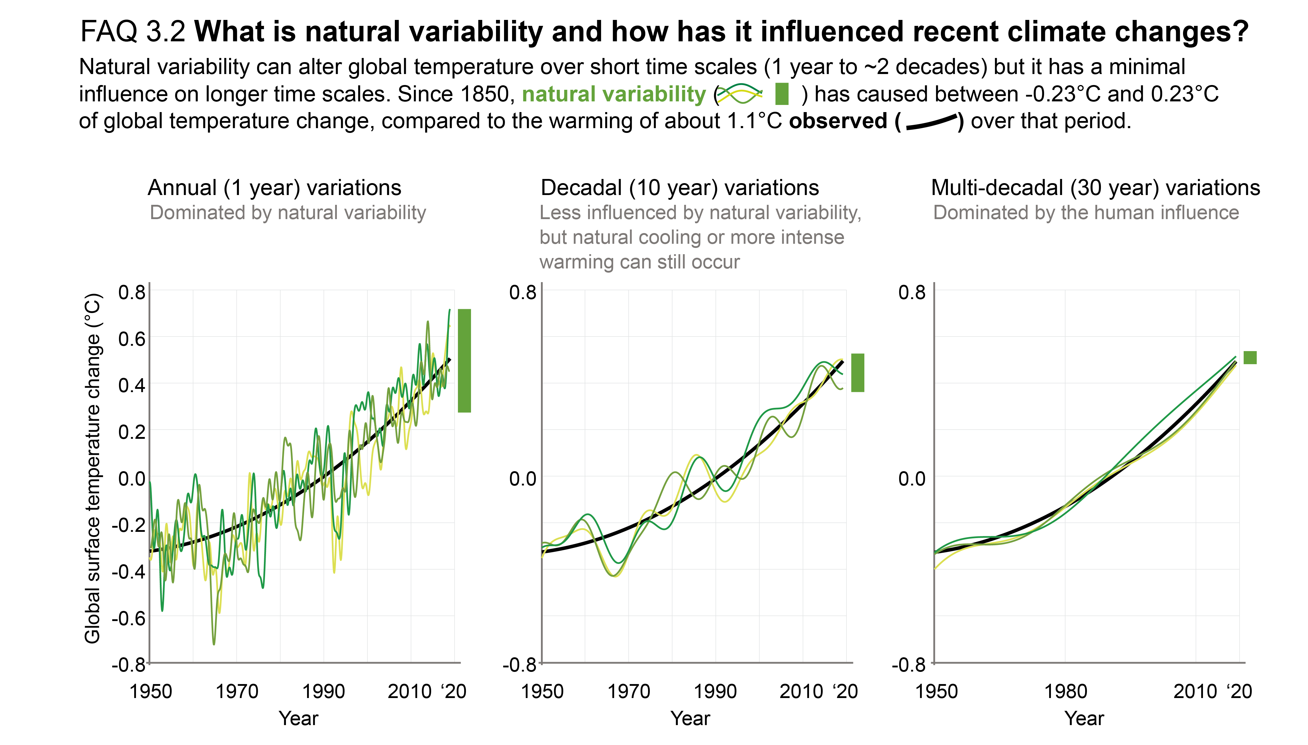
Figure caption
FAQ 3.2, Figure 1 | Annual (left), decadal (middle) and multi-decadal (right) variations in average global surface temperature. The thick black line is an estimate of the human contribution to temperature changes, based on climate models, whereas the green lines show the combined effect of natural variations and human-induced warming, different shadings of green represent different simulations, which can be viewed as showing a range of potential pasts. The influence of natural variability is shown by the green bars, and it decreases on longer time scales. The data is sourced from the CESM1 large ensemble.