Back chapter figures
FAQ 4.1, Figure 1
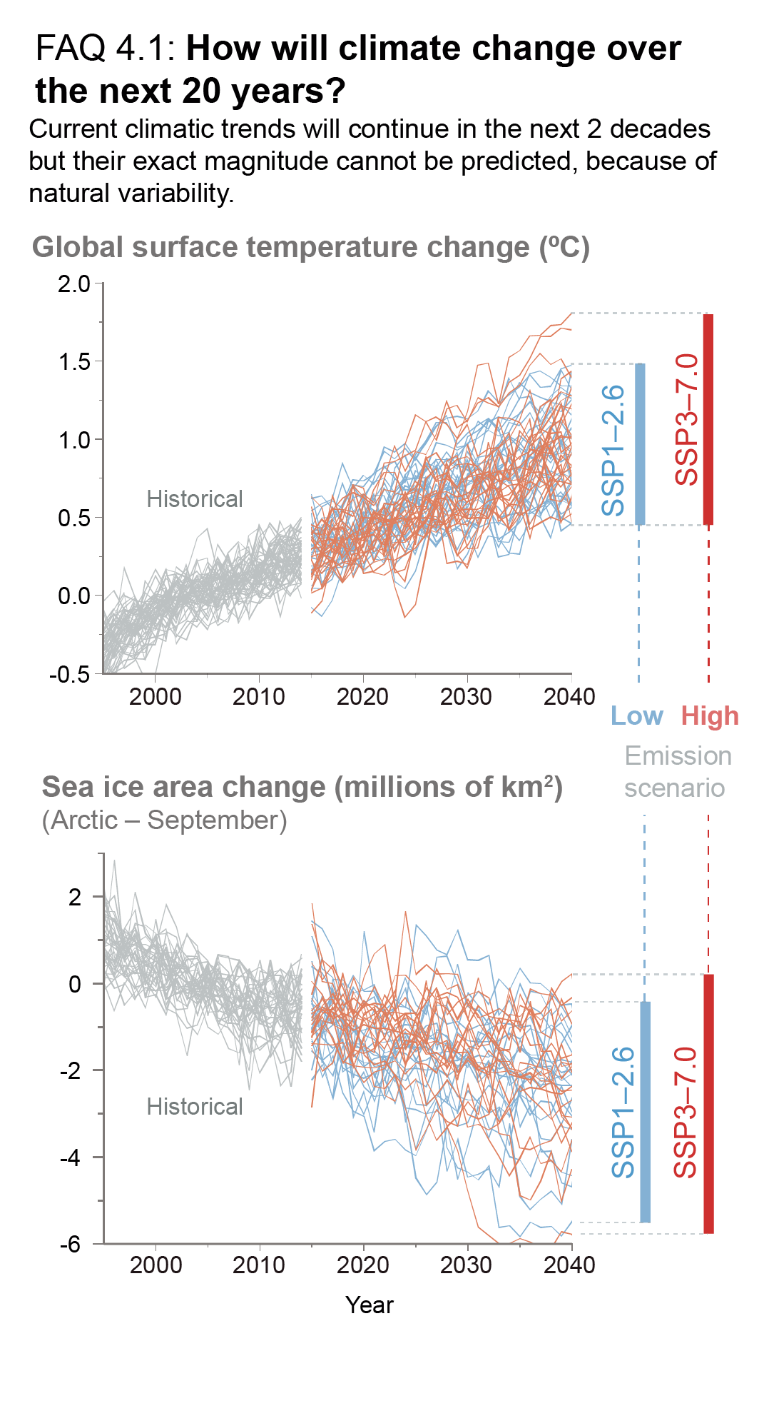
Figure caption
FAQ 4.1, Figure 1 | Simulations over the period 1995–2040, encompassing the recent past and the next twenty years, of two important indicators of global climate change. (Top) Global surface temperature, and (bottom), the area of Arctic sea ice in September. Both quantities are shown as deviations from the average over the period 1995–2014. The grey curves are for the historical period ending in 2014; the blue curves represent a low-emissions scenario (SSP1-2.6) and the red curves one high-emissions scenario (SSP3-7.0).