Back chapter figures
Figure 4.31
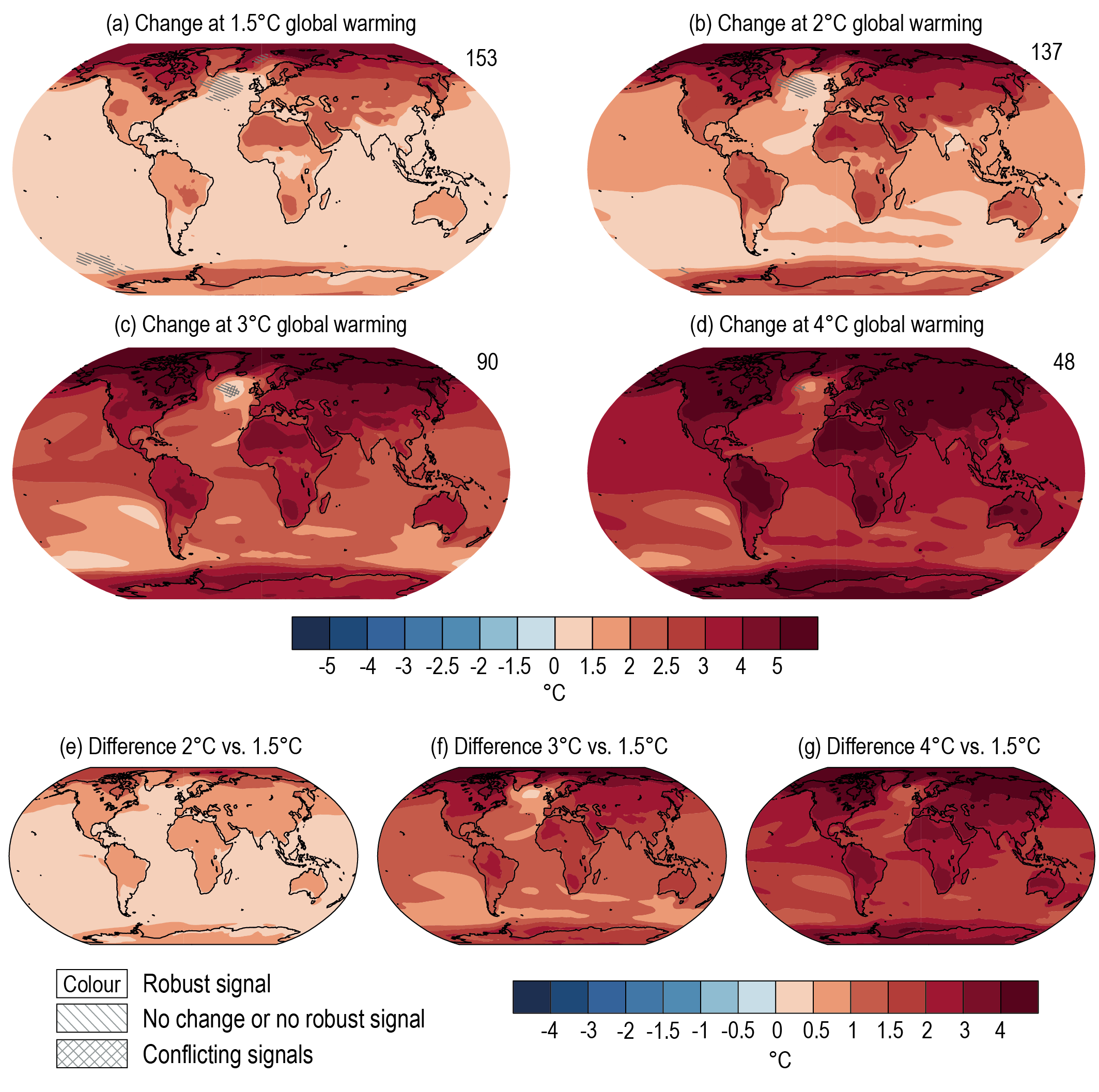
Figure caption
Figure 4.31 | Projected spatial patterns of change in annual average near-surface temperature (°C) at different levels of global warming. Displayed are (a–d) spatial patterns of change in annual average near-surface temperature at 1.5°C, 2°C, 3°C, and 4°C of global warming relative to the period 1850–1900 and (e–g) spatial patterns of differences in temperature change at 2°C, 3°C, and 4°C of global warming compared to 1.5°C of global warming. The number of models used is indicated in the top right of the maps. No overlay indicates regions where the change is robust and likely emerges from internal variability. That is, where at least 66% of the models show a change greater than the internal-variability threshold Section 4.2.6) and at least 80% of the models agree on the sign of change. Diagonal lines indicate regions with no change or no robust significant change, where fewer than 66% of the models show change greater than the internal-variability threshold. Crossed lines indicate areas of conflicting signals where at least 66% of the models show change greater than the internal-variability threshold but fewer than 80% of all models agree on the sign of change. Values were assessed from a 20-year period at a given warming level, based on model simulations under the Tier-1 SSPs of CMIP6. Further details on data sources and processing are available in the chapter data table (Table 4.SM.1).