Figure 2.6
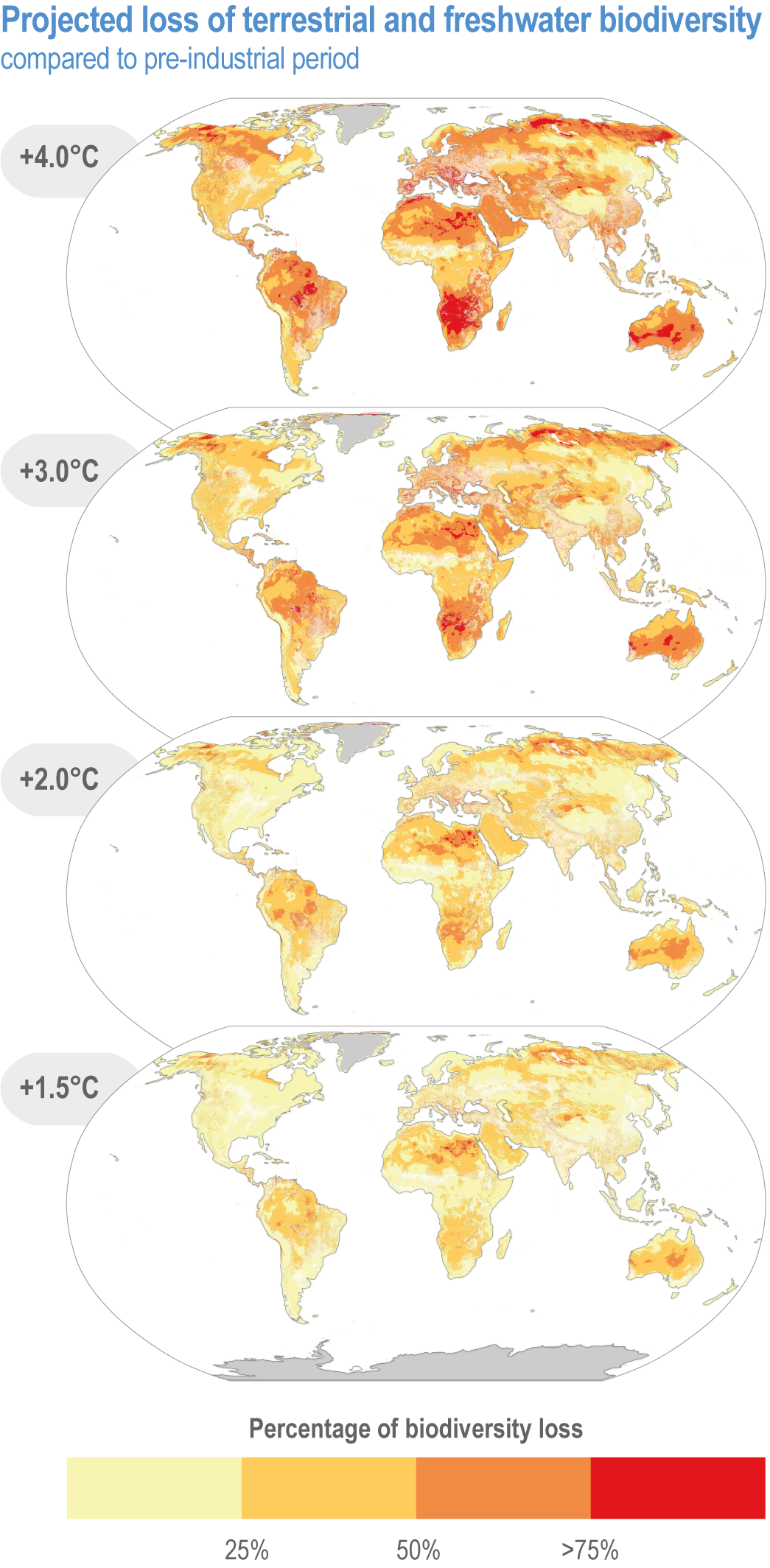
Figure caption
Figure 2.6 | Biodiversity loss for different areas at increasing levels of climate change. The higher the percentage of species projected to lose suitable climate in a given area, the higher the risk to ecosystem integrity, functioning and resilience to climate change. Warming levels are based on global levels (GSAT) above pre-industrial temperatures. Colour shading represents proportion of species for which the climate is projected to become sufficiently unsuitable that the species becomes locally ‘endangered’ and at high risk of local extinction within a given pixel across their current distributions at a given GSAT warming level, based on underlying data (Warren et al., 2018) (modelled n = 119,813 species globally, with no dispersal, averaged over 21 CMIP5 climate models). Areas shaded in deep orange and red represent a significant risk of biodiversity loss (areas where climates become sufficiently unsuitable that it renders >50% and >75% of species at high risk of becoming locally extinct, respectively). The maps of species richness remaining have been overlaid with a landcover layer (2015) from the European Space Agency (ESA) Climate Change Initiative. This landcover layer leaves habitats classified by the ESA as natural as transparent. Areas with a landcover identified as agriculture are 5% transparent, such that the potential species richness remaining if the land had not been converted for agriculture shows as pale shading of the legend colours (very pale yellow to very pale red). These paler areas represent biodiversity loss due to habitat destruction, but with a potential to be restored, with yellow shading having the potential for restoration to greater species richness than orange or red shading.