Figure 8.6
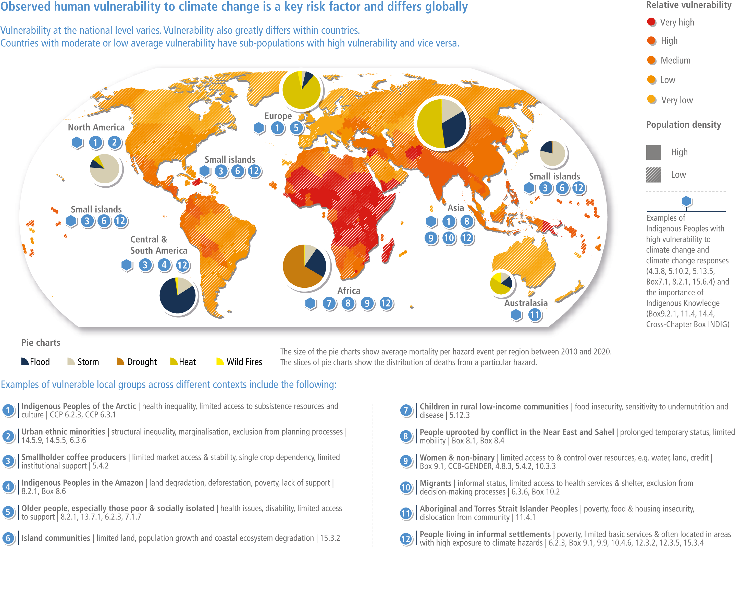
Figure caption
Figure 8.6 | Global map of vulnerability. This map shows the relative level of average national vulnerability as calculated by global indices (INFORM and WRI see details in 8.3.2). Areas shaded light yellow are on average the least vulnerable and those shaded darker red are the most vulnerable. The map combines information about the level of vulnerability (independent of the population size) with the population density (see legend) to show where both high vulnerability and high population density coincide. The map reveals that there are densely populated areas of the world that are highly vulnerable, but also highly vulnerable populations in more sparsely populated areas. There are also highly vulnerable communities and populations in countries with overall low vulnerability as shown with local case studies alongside the map. The pie charts show the number of deaths (mortality) per hazard (storm, flood, drought, heatwaves and wildfires) event per continental region based on EM-DAT Data (CRED, 2020). The size of the pie chart represents the average mortality per hazard event while slices of each pie chart show the absolute number of deaths from each hazard. This reveals that over the past decade, there were significantly more fatalities per hazard in the more vulnerable regions, e.g., Africa and Asia. The analysis of the data shown in this map revealed that over 3.3 billion people are living in countries classified as very highly and highly vulnerable, while approximately 1.8 billion people live in countries with low and very low vulnerability (Birkmann et al., 2022). These vulnerability values are based on the average of the vulnerability components of the INFORM Index (INFORM, 2019) and WorldRiskIndex (Birkmann and Welle, 2016; Feldmeyer et al., 2017) with updated data from 2019 classified into five classes using the quantile method. Other studies applied more vulnerability classes within their assessment and therefore provide slightly different numbers (Birkmann et al., 2021a). However, despite different calculation methods, the conclusion remains that there are significantly more people residing in countries with very high and highly vulnerability compared to those living in countries classified as having low or very low vulnerability.