Figure TS.7 VULNERABILITY
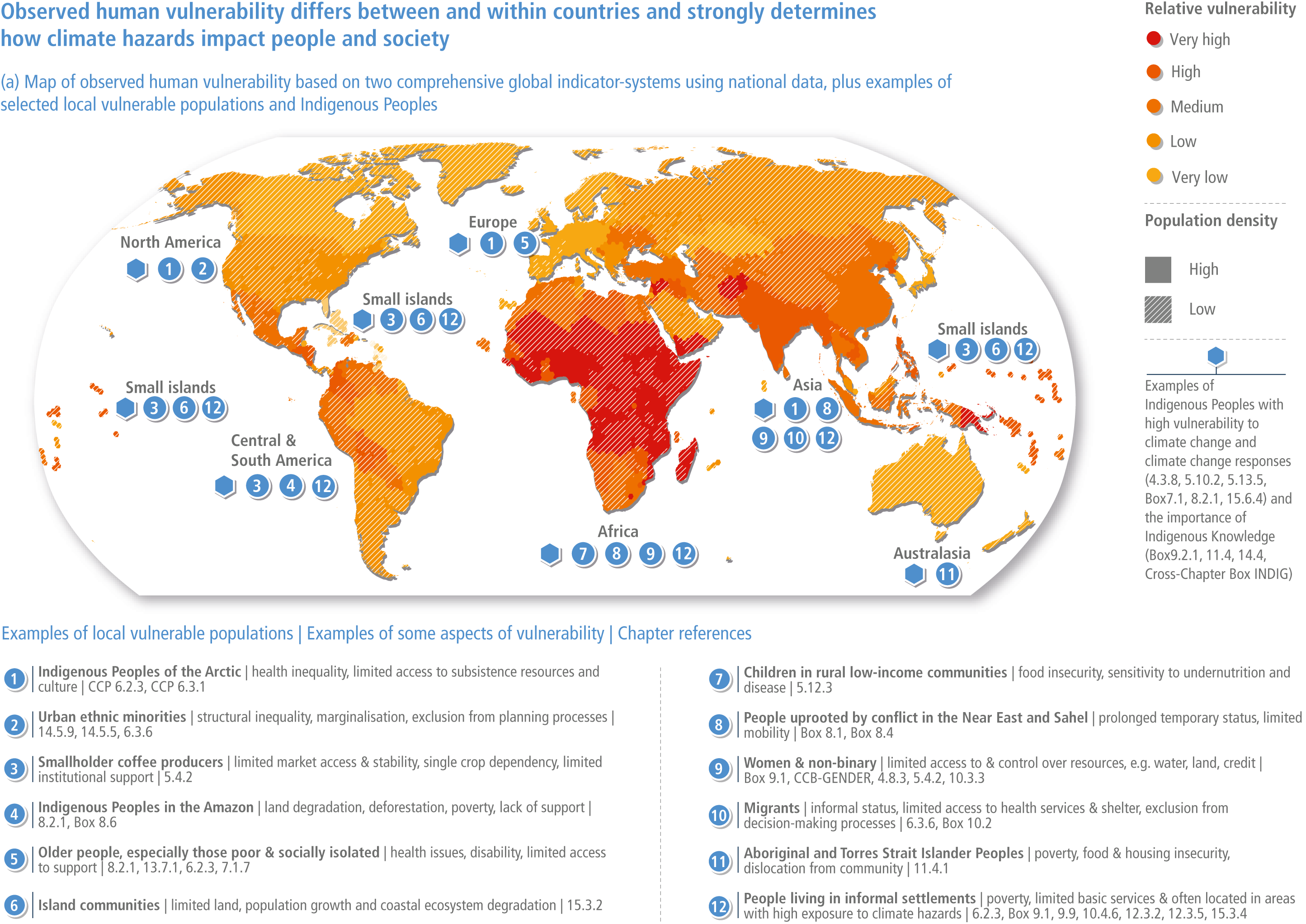
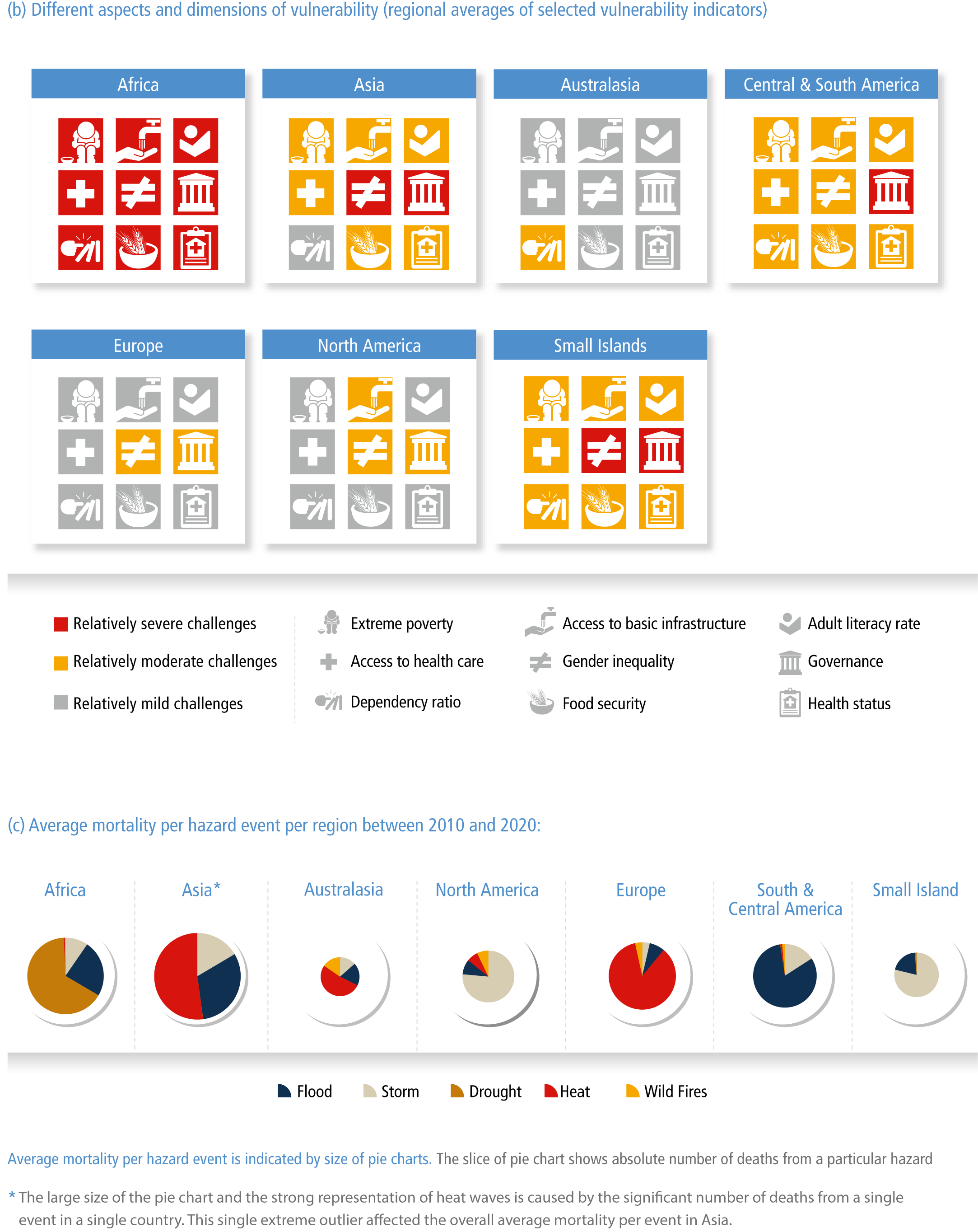
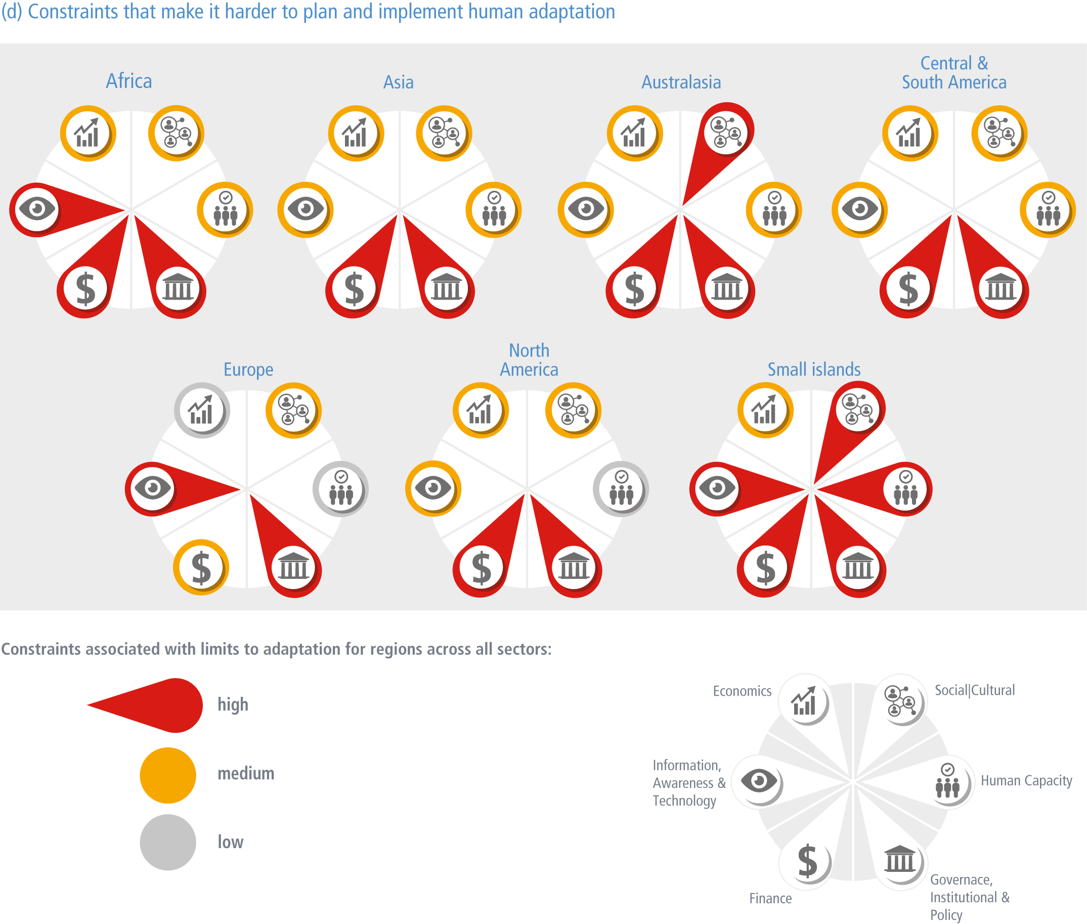
Figure caption
Figure TS.7 VULNERABILITY | (a) The global map of vulnerability is based on two comprehensive global indicator systems, namely INFORM Risk Index and WorldRiskIndex (2019). Climate change hazards and exposure levels are not included in this figure. The relative level of average national vulnerability is shown by the colours. Vulnerability values are based on the average of the two indices, classified into 5 classes using the quantile method. A hexagon binning method was used to simplify the global map and enlarge small states. The map combines information about the level of vulnerability (independent of the population size) with two classes of population density (high density ≥ 20 people/km2 and low density < 20 people/km2). The selected examples of local vulnerable populations underscore that there are also highly vulnerable populations in countries with overall low relative vulnerability {8.3.2, Figure 8.6} (b) This figure shows regional averages for selected aspects of human vulnerability. The indicators are a selection of the indicator systems used within the global vulnerability map (panel a). The colours represent the average value of the respective indicator for the regional level; classified into three classes using natural breaks. This regional information reveals that within all regions challenges exist in terms of different aspects of vulnerability, however, in some regions these challenges are more severe and accumulate in multiple-dimensions. For example, the indicator “dependency ratio” measures the ratio of the number of children (0–14 years old) and older persons (65 years or over) to the working-age population (15–64 years old). {8.3.2, Figure 8.7} (c) The pie charts show the number of deaths (mortality) per hazard (storm, flood, drought, heatwaves and wildfires) event per continental region based on Emergency Events Database (EM-DAT) (Centre for Research on the Epidemiology of Disasters, 2020). The size of the pie chart represents the average mortality per hazard event while slices of each pie chart show the absolute number of deaths from each hazard. This reveals that significantly more fatalities per hazard (storms, floods, droughts, heatwaves and wildfires) did occur in the past decade in more vulnerable regions, e.g. Africa and Asia. {Figure 8.6} (d) The figure shows constraints that make it harder to plan and implement human adaptation. Across regions and sectors, the most significant challenges to human adaptation are financial, governance, institutional and policy constraints. The ability of actors to overcome these socio-economic constraints largely influences whether additional adaptation is able to be implemented and prevent limits to adaptation from being reached. Low: <20% of assessed literature identifies this constraint; Medium: 20–40% of assessed literature identifies this constraint; High: >40% of assessed literature identifies this constraint. {9.3, 16.4.3, Figure 16.8}