Figure 12.1
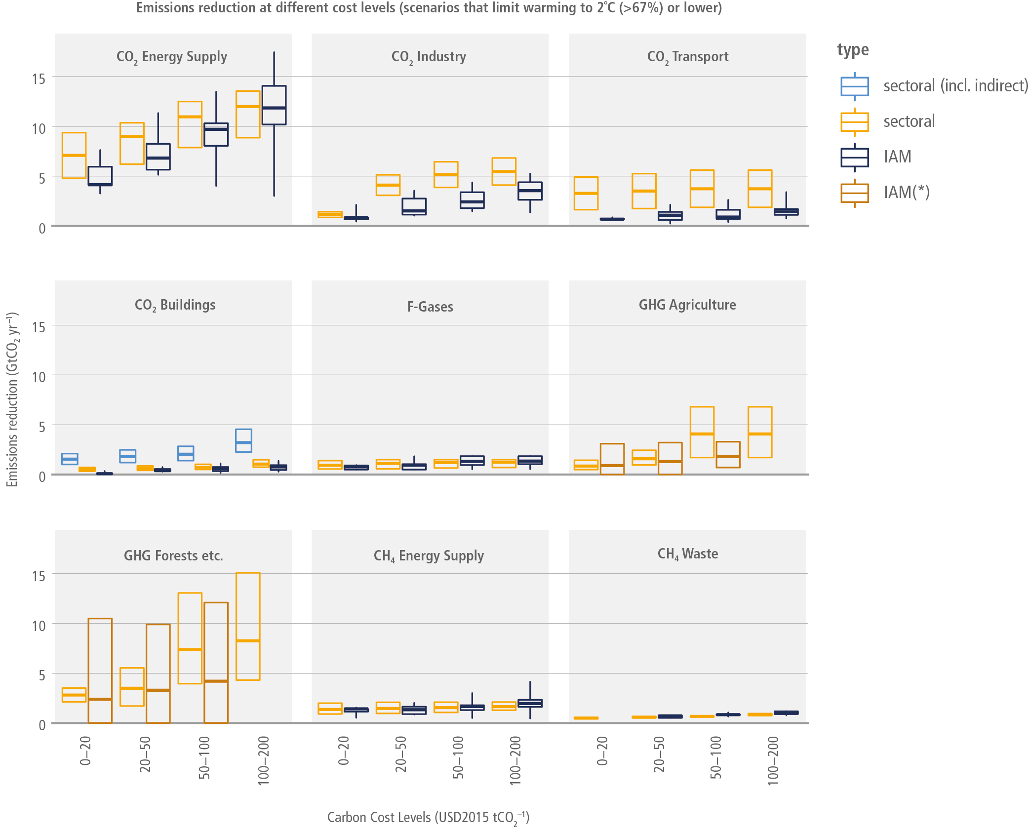
Figure caption
Figure 12.1 | Comparison of sectoral estimates for emissions reduction potential with the emissions reductions calculated using IAMs. Emission reductions calculated using IAMs are given as box plots of global emissions reductions for each sector (dark blue and brown) at different global carbon cost levels (horizontal axis) for 2030, based on all scenarios that limit warming to 2°C (>67%) or lower (see Chapter 3) in the AR6 scenarios database (IIASA 2021). For IAMs, the cost levels correspond to the levels of the carbon price. Hinges in the dark blue box plots represent the interquartile ranges and whiskers extend to 5th and 95th percentiles while the hinges in the brown box plots describe the full range, and the middle point indicates the mean, not the median. In yellow, the estimates from the sectoral analysis are given. In all cases, only direct emissions reductions are presented, except for the light-blue boxes (for buildings), which include indirect emissions reductions. The light-blue boxes are only given for reasons of completeness. For buildings the dark-blue boxes should be compared with the yellow boxes. Light-blue and yellow boxes represent the full ranges of estimates. For IAMs, global carbon prices are applied, which are subject to significant uncertainty.