Back to chapter figures
Figure 3.4
Figure caption
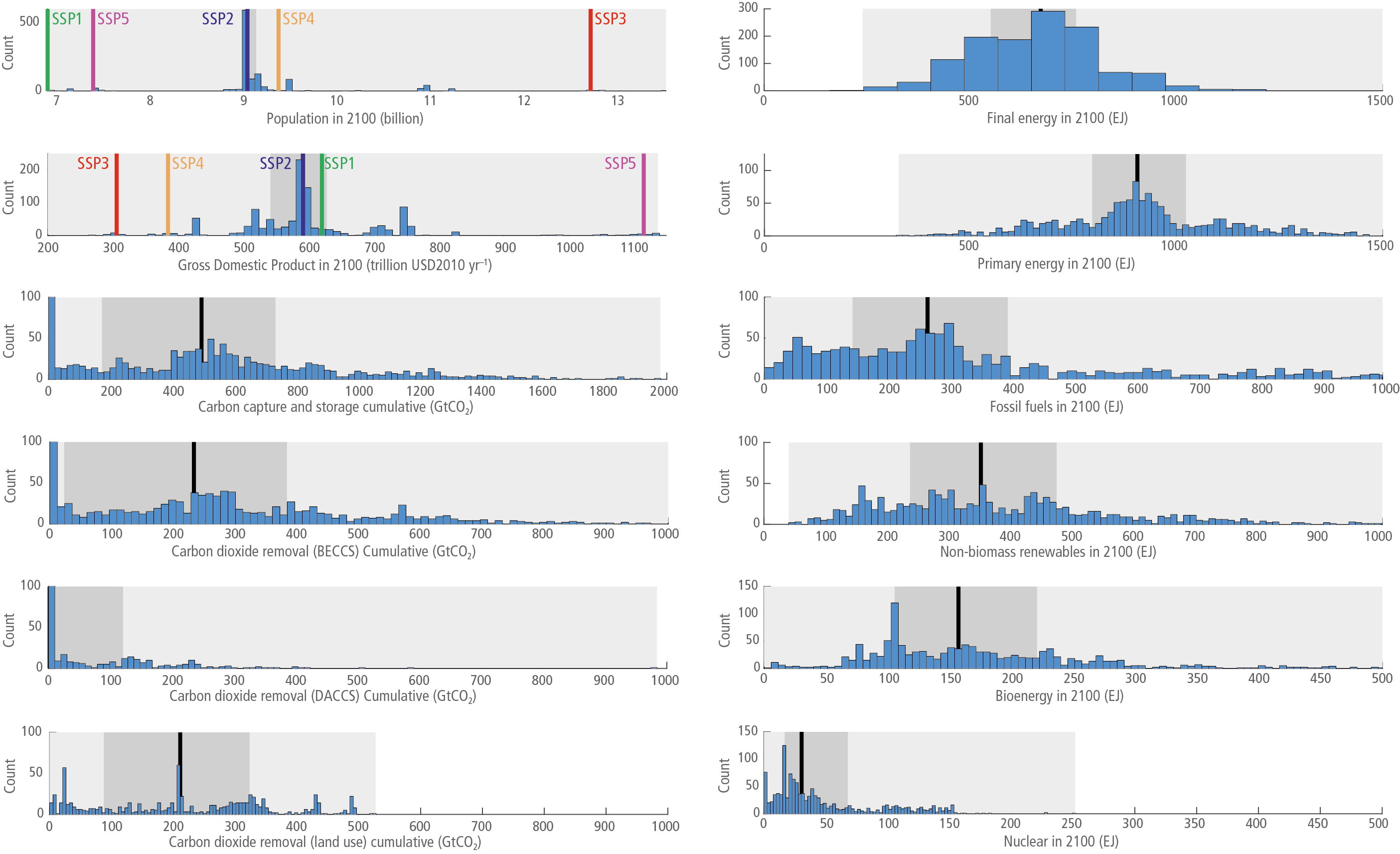
Figure 3.4 | Histograms for key categories in the AR6 scenario database. Only scenarios that passed vetting are shown. For population and GDP, the SSP input data are also shown. The grey shading represents the 0–100% range (light grey), 25–75% range (dark grey), and the median is a black line. The figures with white areas are outside of the scenario range, but the axis limits are retained to allow comparability with other categories. Each sub-figure potentially has different x- and y-axis limits. Each figure also potentially contains different numbers of scenarios, depending on what was submitted to the database. Source: AR6 scenarios database.
