Back to chapter figures
Figure 5.8
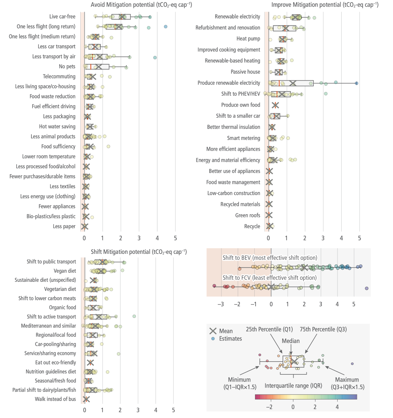
Figure caption
Figure 5.8 | Synthesis of 60 demand-side options ordered by the median GHG mitigation potential found across all estimates from the literature. The grey crosses are averages. The boxes represent the 25th percentile, median and 75th percentiles of study results. The whiskers or dots show the minimum and maximum mitigation potentials of each option. Negative values (in the red area) represent the potentials for backfire due to rebound, i.e., a net increase of GHG emissions due to adopting the option. Source: with permission from Ivanova et al. (2020).