Figure 7.5
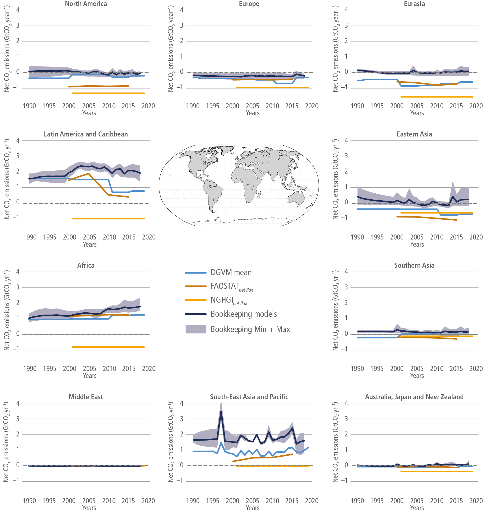
Figure caption
Figure 7.5 | Regional net flux of CO2 due to AFOLU estimated using different methods for the period 1990–2019 (GtCO2 yr–1). Positive numbers represent emissions. The upper-central panel depicts the world map shaded according to the IPCC AR6 regions corresponding to the individual graphs. For each regional panel; brown line: Total net flux data from FAOSTAT (Tubiello et al. 2020); yellow line: Net emissions estimates from National Greenhouse Gas Inventories based on country reports to the UNFCCC for LULUCF (Grassi et al. 2021); dark-blue line: The mean estimate and minimum and maximum (dark-blue shading) from three bookkeeping models. (Hansis et al. 2015; Houghton and Nassikas 2017; Gasser et al. 2020). Regional estimates from bookkeeping models are available at: https://zenodo.org/record/5548333#.YVwJB2LMJPY (Minx et al. 2021). See the legend in Figure 7.4 for a detailed explanation of flux components for each dataset.