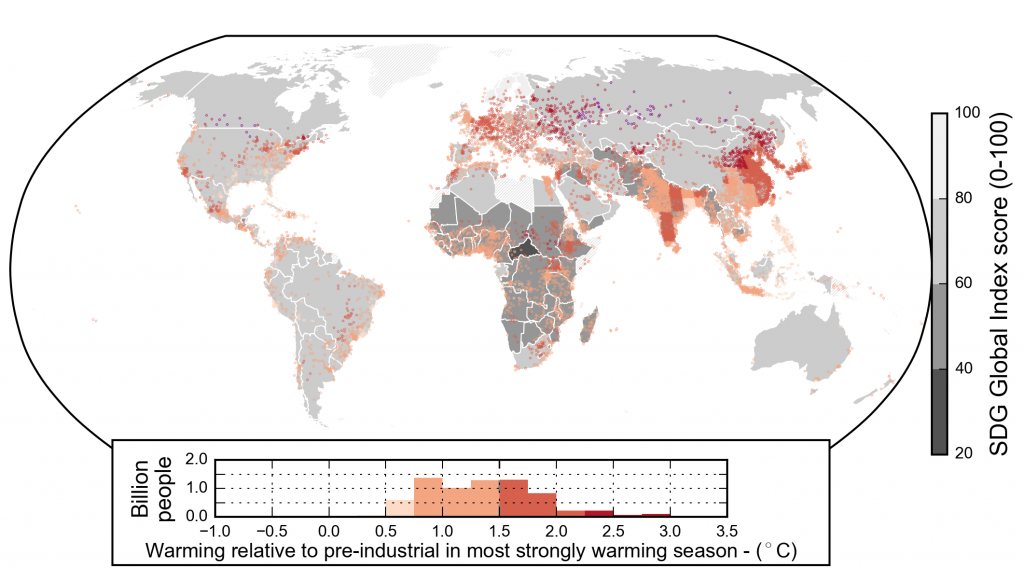
Human experience of present-day warming. Different shades of pink to purple indicated by the inset histogram show estimated warming for the season that has warmed the most at a given location between the periods 1850–1900 and 2006–2015, during which global average temperatures rose by 0.91°C in this dataset (Cowtan and Way, 2014) and 0.87°C in the multi-dataset average (Table 1.1 and Figure 1.3). The density of dots indicates the population (in 2010) in any 1° × 1° grid box. The underlay shows national Sustainable Development Goal (SDG) Global Index Scores indicating performance across the 17 SDGs. Hatching indicates missing SDG index data (e.g., Greenland). The histogram shows the population living in regions experiencing different levels of warming (at 0.25°C increments). See Supplementary Material 1.SM for further details.