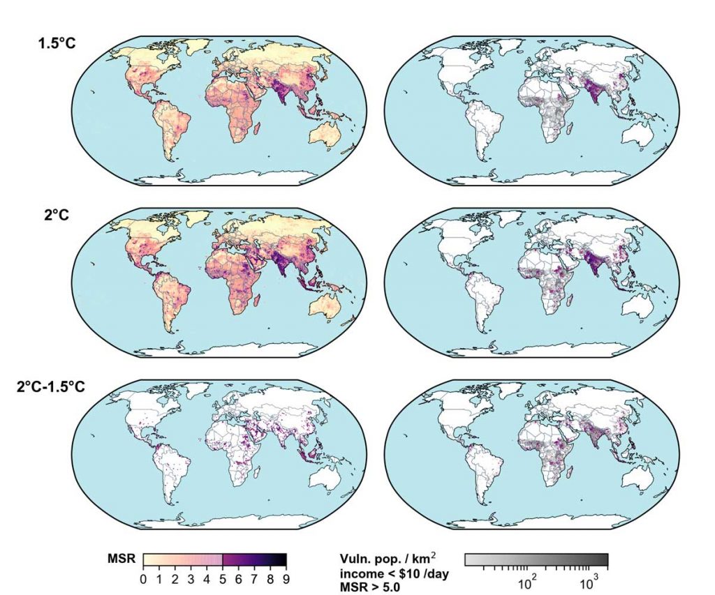
Multi-sector risk maps for 1.5°C (top), 2°C (middle), and locations where 2°C brings impacts not experienced at 1.5°C (2°C–1.5°C; bottom).
The maps in the left column show the full range of the multi-sector risk (MSR) score (0–9), with scores ≤5.0 shown with a transparency gradient and scores >5.0 shown with a colour gradient. Score must be >4.0 to be considered ‘multi-sector’. The maps in the right column overlay the 2050 vulnerable populations (low income) under Shared Socio-Economic Pathway (SSP)2 (greyscale) with the multi-sector risk score >5.0 (colour gradient), thus indicating the concentrations of exposed and vulnerable populations to risks in multiple sectors. Source: Byers et al. (2018).