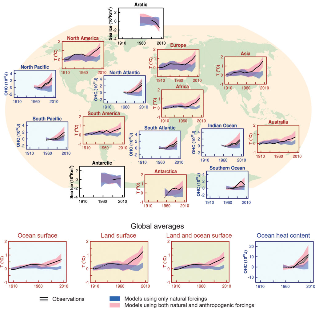
Figure TS.12
Comparison of observed and simulated change in the climate system, at regional scales (top panels) and global scales (bottom four panels). Brown panels are land surface temperature time series, blue panels are ocean heat content time series and white panels are sea ice time series (decadal averages). Each panel shows observations (black or black and shades of grey), and the 5 to 95% range of the simulated response to natural forcings (blue shading) and natural and anthropogenic forcings (pink shading), together with the corresponding ensemble means (dark blue and dark red respectively). The observed surface temperature is from the Hadley Centre/Climatic Research Unit gridded surface temperature data set 4 (HadCRUT4). Three observed records of ocean heat content (OHC) are shown. Sea ice anomalies (rather than absolute values) are plotted and based on models in Figure 10.16. The observations lines are either solid or dashed and indicate the quality of the observations and estimates. For land and ocean surface temperatures panels and precipitation panels, solid observation lines indicate where spatial coverage of areas being examined is above 50% coverage and dashed observation lines where coverage is below 50%. For example, data coverage of Antarctica never goes above 50% of the land area of the continent. For ocean heat content and sea ice panels the solid observations line is where the coverage of data is good and higher in quality, and the dashed line is where the data coverage is only adequate. This figure is based on Figure 10.21 except presented as decadal averages rather than yearly averages. Further detail regarding the related Figure SPM.6 is given in the TS Supplementary Material. {Figure 10.21}
You may freely download and copy the material contained on this website for your personal, non-commercial use, without any right to resell, redistribute, compile or create derivative works therefrom, subject to more specific restrictions that may apply to specific materials.