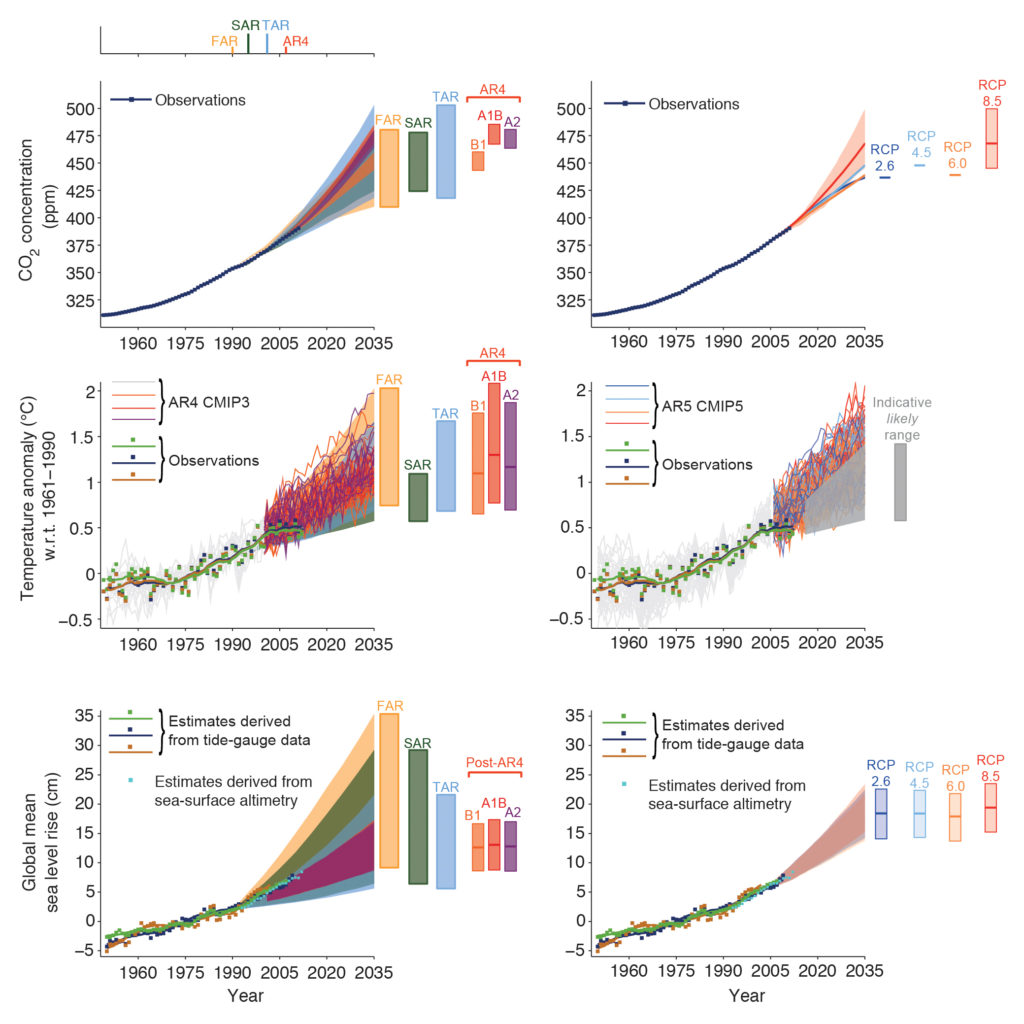
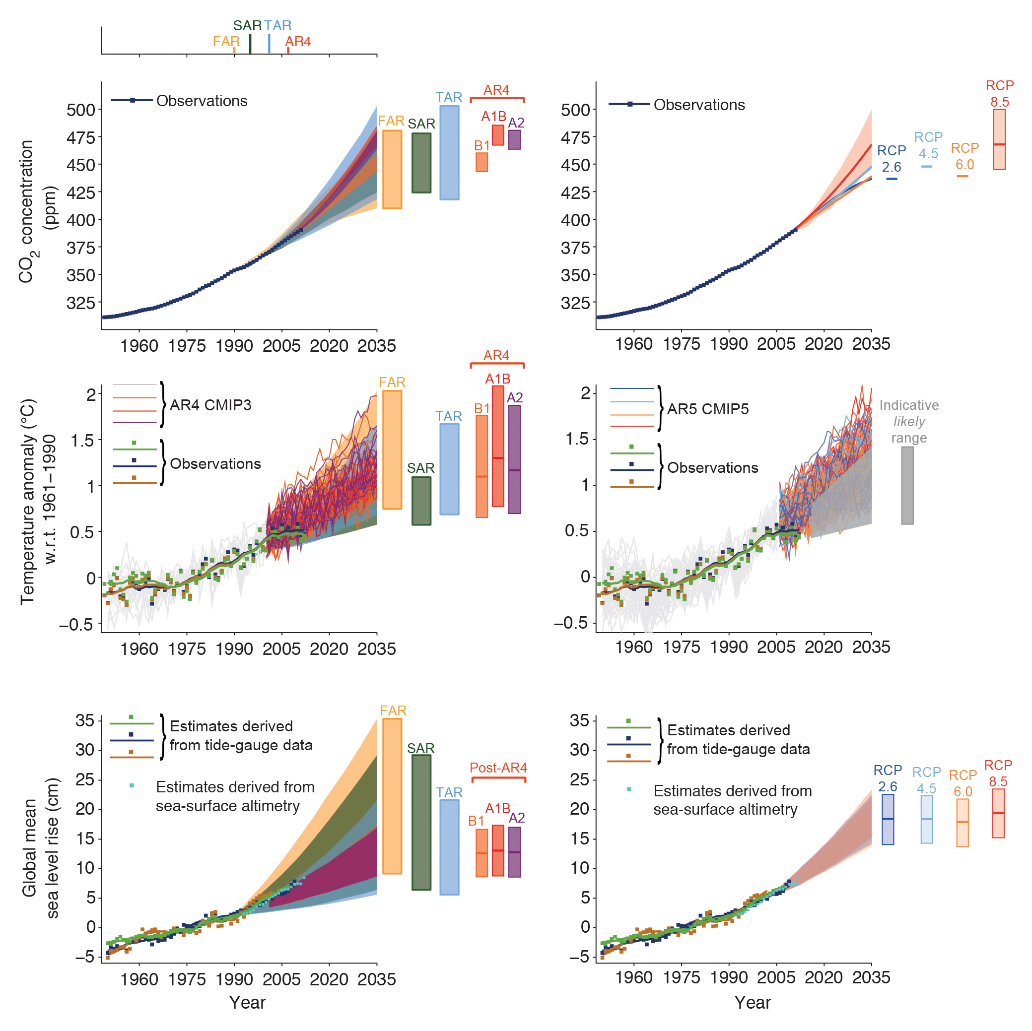
TFE.3, Figure 1
(Top left) Observed globally and annually averaged CO2 concentrations in parts per million (ppm) since 1950 compared with projections from the previous IPCC assessments. Observed global annual CO2 concentrations are shown in dark blue. The shading shows the largest model projected range of global annual CO2 concentrations from 1950 to 2035 from FAR (First Assessment Report; Figure A.3 in the Summary for Policymakers (SPM) of IPCC 1990), SAR (Second Assessment Report; Figure 5b in the TS of IPCC 1996), TAR (Third Assessment Report; Appendix II of IPCC 2001), and for the IPCC Special Report on Emission Scenarios (SRES) A2, A1B and B1 scenarios presented in the AR4 (Fourth Assessment Report; Figure 10.26). The publication years of the assessment reports are shown. (Top right) Same observed globally averaged CO2 concentrations and the projections from this report. Only RCP8.5 has a range of values because the emission-driven senarios were carried out only for this RCP. For the other RCPs the best estimate is given. (Middle left) Estimated changes in the observed globally and annually averaged surface temperature anomaly relative to 1961–1990 (in °C) since 1950 compared with the range of projections from the previous IPCC assessments. Values are harmonized to start from the same value at 1990. Observed global annual temperature anomaly, relative to 1961–1990, from three data sets is shown as squares and smoothed time series as solid lines from the Hadley Centre/Climatic Research Unit gridded surface temperature data set 4 (HadCRUT4; bright green), Merged Land–Ocean Surface Temperature Analysis (MLOST; warm mustard) and Goddard Institute for Space Studies Surface Temperature Analysis (GISTEMP; dark blue) data sets. The coloured shading shows the projected range of global annual mean near surface temperature change from 1990 to 2035 for models used in FAR (Figure 6.11), SAR (Figure 19 in the TS of IPCC 1996), TAR (full range of TAR, Figure 9.13(b)). TAR results are based on the simple climate model analyses presented in this assessment and not on the individual full three-dimensional climate model simulations. For the AR4 results are presented as single model runs of the CMIP3 ensemble for the historical period from 1950 to 2000 (light grey lines) and for three SRES scenarios (A2, A1B and B1) from 2001 to 2035. For the three SRES scenarios the bars show the CMIP3 ensemble mean and the likely range given by –40 % to +60% of the mean as assessed in Chapter 10 of AR4. (Middle right) Projections of annual mean global mean surface air temperature (GMST) for 1950–2035 (anomalies relative to 1961–1990) under different RCPs from CMIP5 models (light grey and coloured lines, one ensemble member per model), and observational estimates the same as the middle left panel. The grey shaded region shows the indicative likely range for annual mean GMST during the period 2016–2035 for all RCPs (see Figure TS.14 for more details). The grey bar shows this same indicative likely range for the year 2035. (Bottom left) Estimated changes in the observed global annual mean sea level (GMSL) since 1950. Different estimates of changes in global annual sea level anomalies from tide gauge data (dark blue, warm mustard, dark green) and based on annual averages of altimeter data (light blue ) starting in 1993 (the values have been aligned to fit the 1993 value of the tide gauge data). Squares indicate annual mean values, solid lines smoothed values. The shading shows the largest model projected range of global annual sea level rise from 1950 to 2035 for FAR (Figures 9.6 and 9.7), SAR (Figure 21 in TS of IPCC, 1996), TAR (Appendix II of IPCC, 2001) and based on the CMIP3 model results available at the time of AR4 using the SRES A1B scenario. Note that in the AR4 no full range was given for the sea level projections for this period. Therefore, the figure shows results that have been published subsequent to the AR4. The bars at the right hand side of each graph show the full range given for 2035 for each assessment report. (Bottom right) Same observational estimate as bottom left. The bars are the likely ranges (medium confidence) for global mean sea level rise at 2035 with respect to 1961–1990 following the four RCPs. Appendix 1.A provides details on the data and calculations used to create these figures. See Chapters 1, 11 and 13 for more details. {Figures 1.4, 1.5, 1.10, 11.9, 11.19, 11.25, 13.11}
You may freely download and copy the material contained on this website for your personal, non-commercial use, without any right to resell, redistribute, compile or create derivative works therefrom, subject to more specific restrictions that may apply to specific materials.